-

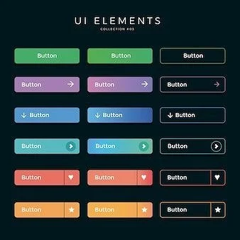
Buttons are something we use on the daily, yet are probably not something that is thought of often (except for maybe the people designing them or frustrated users trying to navigate a site with poorly designed ones…
The fact is, buttons are a very important aspect of good web design, and can get people to the information they need quickly, if they can promptly recognize and click on the button they need.
-
What Makes a well designed button?
- A call to action (CTA) directing the user to an interaction in a site
- A recognizable shape (rectangles are the most recognized)
- Contrasted (the font color meets the contrast standard from its button background color. Use a contrast checker such as Stark to verify)
- Consistent (meaning all the buttons in a site should have the same style. For example, all buttons should have the same border radius throughout the site)
- Heirarchical (have primary, secondary, and tertiary buttons - see article below for more information on this…)
The Importance of Well Designed Buttons
-

visibility & Placement
Button visibility is a crucial part of good interface design. It also improves accessibility and can help to reinforce branding. To see something on a page that you would like to access or interact with, but could not find the button to do so, would be very frustrating. Here are some ways that create higher visibility of buttons for our users:
Visibility:
- Size & Clarity
- Contrast & Readability
- Consistent styling of all buttons in site
- Hover Effect
-Dropshadows (can create a 3 dimensional effect and look more like a button)
Placement:
-Strategic positioning (buttons must be where the user expects them to be and align with natural user behavior)
- Try not to overcrowd an area with too many buttons. This can cause someone confusion and make it harder to click on the right button
- Mobile phones need to have enough space from the screen’s edges…It is also a good idea to place buttons in the most thumb-reachable zones. Ensuring each button is large enough to be clickable is also a good idea
-

what size works best?
The size a designer chooses for their buttons are of course up to them, and the way that they wish to create their project. This is just a recommendation for higher usability and can be adjusted as needed:
Mobile: 44 × 44 pts (minimum)
Mobile: (for Android): 48 × 48 pts
Tablet: 48 × 48 pts (minimum)
Desktop: 50-60 pts
Buttons need to be large enough for the user’s finger to click on for touch screens (especially in mobile design), and also large enough for a mouse to click on for a desktop. However, they should not be so large that it can be mistaken for just being a banner image, and missed let’s say. Size matters.
-

Heirarchy in Button Design
Buttons in a website need to be defined according to their level of importance. The following are 3 different categories that create a flow for the user in the design of an interface:
Primary: Should be the most visually prominent. Examples would be buttons for “Submit”, “Sign Up”, or “Next”
Secondary: Used for supportive actions that are not as urgent as the main task. Examples would be “Cancel”, “Learn More”, or “Back”
Tertiary: Used for lower-priority actions in a site. Examples would be buttons for “View Details”, “More Options”, or “Forgot Password?”
-

Enhancing Buttons with Hover Effects
Immediately changing the color of a Button when the user hovers on it gives them instant readability that their action is working. Giving users visual feedback of each change that a button may go through tells the user that the button is clickable and functioning. Ways to show a user that a button is clickable are:
- Color Change
- Using Box Shadows for Depth & Emphasis
- Scaling size (showing a slight size increase in the button can enhance responsiveness
- Adding a Glow Effect can work well for darker backgrounds and create a futuristic appeal
- Using animated underlines can also show change happening in text-based buttons
-

Clear & Distinct labelling
It is important that a user understands precisely what action a Button will carry out when clicked. Also, when coming up with Label names, trying to use an action verb that is specific to the task, will tell the user specifically what will happen after they click the Button. This will help to give the user confidence in navigating and interacting within the website.
-

Alignment Matters
Looking at a Button with the text not centered both Horizantally and Vertically can disrupt the Harmony and Visual Balance of a Site’s design. It is like looking at a picture hanging on a wall, that is slightly crooked (well, it is for myself, anyhow)…
Centering and Aligning text properly is so important in Button design, as it lets our brain work ever-so-slightly less and creates balance.
When a user is scanning a website, it increases Readability and Comfort, ensuring a smooth read.
Basic button styling IN HTML & CSS
Here are some other useful resources on Great Button Design:


